Work with actionable fragments
Actionable text template fragments let you add links to resources, or respond to a user selection with whatever additional information the notification might need.
This feature is intended to complement buttons, especially those that include a call to action (cta property), not to replace them.
How it works
An actionableText template fragment type includes an onClick property that fires an event you define when the user selects the fragment.
The container and list template fragment types now also include this property.
Note that the text template fragment does not include the onClick property.
To provide user interaction with inline body text, you must use the actionableText fragment type.
The control property of NotificationActionEvent that's sent to your notification provider when your users interact with a notification now includes these template fragments, so that you can create the appropriate response.
For a higher-level discussion of custom templates, see Customize notifications.
How to do it
// create the template structure
const customTemplate: CustomTemplateOptions = {
  buttons: {
    align: "right"
  },
  body: {
    compositions: [
      {
        minTemplateAPIVersion: "1",
        layout: {
          type: TemplateFragmentNames.container,
          onClick: { someProperty: "container was clicked" },
          style: {
            display: "flex",
            flexDirection: "column"
          },

          // define all actionable fragments
          // note the onClick property for each, which lets you define your own event to fire
          children: [

            // container fragment with onClick property
            // onClick parameters are defined by the notification provider
            {
              type: TemplateFragmentNames.container,
              onClick: { someProperty: "container was clicked" },
              tooltipKey: "containerTooltip",
              style: {
                display: "flex",
                flexFlow: "row wrap",
                justifyContent: "center",
                paddingTop: "10px"
              },
              children: [

                // image fragment with onClick property
                {
                  type: TemplateFragmentNames.image,
                  dataKey: "imageUrl",
                  onClick: { someProperty: "image was clicked" },
                  tooltipKey: "imageTooltip",
                  style: {
                    width: "500px",
                    padding: "5px"
                  }
                }
              ]
            },

            // text fragment. No user interaction.
            {
              type: TemplateFragmentNames.text,
              dataKey: "description"
            },

            // actionableText fragment. User interaction with onClick property
            {
              type: TemplateFragmentNames.actionableText,
              dataKey: "actionableText",
              tooltipKey: "actionableTextTooltip",
              onClick: { clicked: "actionableText was clicked" }
            }
          ]
        }
      }
    ]
  }
};

// define the notification
const customNote: NotificationOptions = {
  title: "Custom Template Notification",
  icon: "LOGO.png",
  toast: "sticky",

  // user interaction with button
  buttons: [
    {
      title: "CTA Button",
      iconUrl: "favicon.ico",
      onClick: { btn: "Button 1 clicked" },
      cta: true
    }
  ],
  template: "custom",

  // include the custom template and define the properties declared there
  // this example illustrates all actionable fragments literally
  templateOptions: customTemplate,
  templateData: {
    title: "title",
    imageUrl: "https://EXAMPLE.COM/examples/notifications/graph2.png",
    description: `description`,
    actionableText: "Actionable Text",
    actionableTextTooltip: "Click actionable text",
    imageTooltip: "Click Image",
    containerTooltip: "Click container"
  }
};
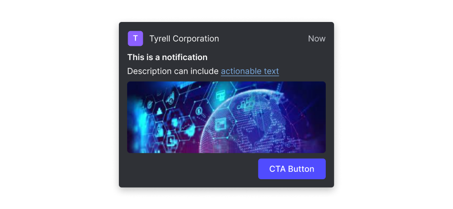
The resulting notification:

// respond to user interaction
addEventListener("notification-action", (event: NotificationActionEvent) => {
    const { control, result } = event;
    if (
      control &&
      (control.type === "actionableText" ||
        control?.type === "container" ||
        control.type === "image")
    ) {
      alert("Clickable template fragment was clicked \n" + JSON.stringify(result));
    }
  });
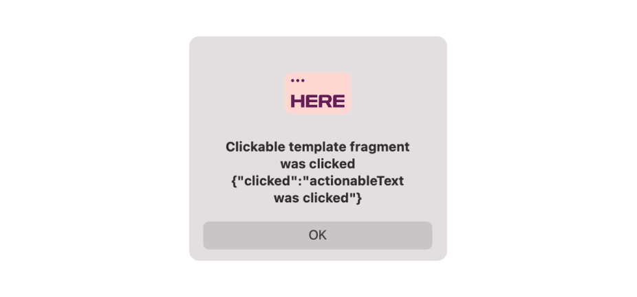
And the response after the user clicks the notification:
