Get started with notifications
The openfin-notifications package is deprecated starting with v2.0.0 of the package; the @openfin/workspace/notifications package is deprecated starting with v23.0. They are both replaced by the @openfin/notifications package.
When using the @openfin/notifications or the (deprecated)@openfin/workspace/notifications packages, Notification Center does not start automatically.
To use the notification center client API, you must first register your notification center platform, whether you use the HERE CDN or self-host.
For more information, see Register notifications.
Basic elements
A notification contains the following configurable areas:
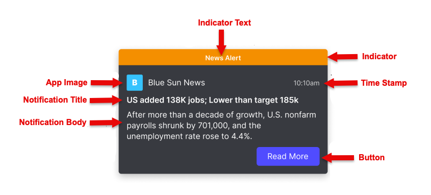
You work with the properties of the NotificationOptions object to create or update a notification:
-
Indicator: Optional banner to call attention to the rest of the notification. See Configure important notifications.
-
indicator.text -
indicator.color
-
-
Basic identifying information
-
icon: Optional image to help identify the application that sent the notification. -
date: Optional timestamp. If not specified, defaults to current date and time. -
title: Required title to introduce the notification.titleandbodyare the only required properties.
-
-
The main section, specified with a template. One of:
-
TemplateMarkdown, specified with thebodyproperty (can also beform): a string that can contain inline Markdown formatting. -
TemplateList, specified with thelistproperty: a list of string pairs. -
TemplateCustom, specified with thetemplateOptionsandtemplateDataproperties: a custom template and the data to populate it. For more information, see Work with custom notification templates.
-
-
Buttons: A row of buttons for the user to take action or dismiss the notification.
button: a list of ButtonOptions. For more information, see Buttons in a notification.
Interactive elements
You can add other elements, to help your users interact with the notification or to organize notifications in Notification Center. These elements include:
-
Forms. See Forms in notifications
-
Streams. See Streams of notifications
-
Reminders. See Notification reminders
-
Actionable fragments. See Work with actionable fragments
Toasts
By default, a notification appears as a transient "toast" on the desktop.
You can use the toast property to make it remain until acted on by the user or to appear only in Notification Center.
Sounds
In Notifications v2.4 or later, you can suppress the sound users hear when a notification arrives.
The soundOptions object includes the mode property, which you can set to 'silent' if you create your own custom sounds for notifications, for example.
Before you start creating notifications, you can call the getUserSettingStatus(UserSettings.SOUND_ENABLED) method to check whether a user has disabled sound in Notification Center.
You should also monitor the ToggleNotificationSound event to check whether a user has disabled sound at any point, so that you don't override user settings when you create notifications.
Shortcuts
In Notifications v2.5 or later (HERE Core UI Components 17.2 or later), users can disable the default shortcut to navigate to Notification Center.
They can also specify their own shortcut keys.
As a developer, you can call the setDefaultPlatformShortcut function to specify your own shortcut.
The default shortcut is Control+/.
Create a basic notification
-
Import the appropriate package, and register your notifications platform. See Register notifications.
-
Define and create the notification illustrated in the card image in this article:
const exampleNotification: BaseNotificationOptions =
{
  // banner at the top of the notification
  indicator:
  {
    color: 'orange',
    text: 'News Alert',
  },

  icon: 'https://EXAMPLE.COM/examples/notifications/company-B.png', //optional
  title: 'US added 138K jobs; Lower than target 185K', // required
  // TemplateMarkdown
  body: 'After more than a decade of growth, U.S. nonfarm payrolls shrunk by 701,000, and the unemployment rate rose to 4.4%...',
  // simple button
  buttons:
  [
    {
      title: “Read More”,
      type: “button”,
      cta: true,
      // see main article on buttons for more complex actions you can invoke with a button
      // this is the simplest possible example, provides only an informational link
      onClick:
      {
        window.open("https://EXAMPLE.COM/news/employment”, "_blank")
      }
    }
  ]
  // optional, disable to support custom sounds
  soundOptions:
  {
    mode: 'silent'
  }
};

create(exampleNotification);