Color themes in HERE Core UI Components
Starting in HERE Core UI Components 5.0, you can customize the colors of the user interface elements used in Browser by defining a color theme. With HERE Core UI Components 5.5, the use of themes includes Home and Store.
You can define and register a theme for a HERE Core UI platform. If you don't define a theme, you get a default palette.
Colors can be specified in the following ways:
- Hexadecimal, not case specific, 3 (#F0F) or 6 characters (#FF00FF)
- HSL/HSLA
- RGB/RBGA
- CSS color names — optional color properties only
The backgroundPrimary color property must be specified using a numeric format (that is, not a name); otherwise errors are thrown.
Starting in HERE Core UI Components v10, your users can choose a light or dark color scheme, or the underlying OS color scheme. You can provide custom light and dark schemes as part of your custom theme, or you can define only a light scheme or a dark scheme to provide the same scheme to all your users.
You can also customize the location and UI string of the default Appearance menu. For details, see Customize light/dark scheme menu.
If a user's system contains multiple HERE Core UI platforms, each component (Browser, Home, and Store) retains the theme of the HERE Core UI platform it was opened with, until closed or changed. Therefore, the user's screen may show HERE Core UI windows with different themes, depending on which platform created each window.
Simple theming
The most straightforward way to define a theme is to define only the required properties:
brandPrimarybrandSecondarybackgroundPrimary
All other properties then either are generated based on these color values or use default colors.
The properties background1 to background6 are generated based on backgroundPrimary. Internally, the backgroundPrimarycolor is translated into HSL format, and then other shades are generated by varying the saturation and lightness values. The following diagram shows how shades are generated based on the color red, which has a hue value of 352.
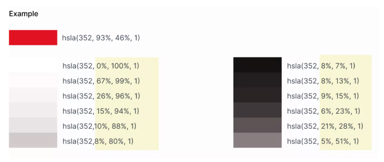
The generated values are used to provide depth for visual components, such as for drop shadows.
Other colors are generated from brandPrimary and brandSecondary. These include colors for active, hover, focused, and text.
Code example
const wp = WorkspacePlatform.init({
…
  theme: [
    {
      label: 'MyTheme',
      palette: {
        brandPrimary: '#0661DC',  // Hexadecimal, 3 or 6 digits
        brandSecondary: rgb(170, 136, 166) , // RGB, optional: rgba()
        backgroundPrimary:  hsl(3, 23%, 17%)  // HSL, optional: hsla()
      }
    }
  ],
});
UI mappings of required properties
This PDF illustrates the color properties that you can set for a theme.