Save users' layouts
Users with data-heavy workflows often need to be able to combine several sources of information to view at a glance. HERE Core provides the layouts capability to let users do this within a single window, so they can complete their tasks quickly and easily without switching through multiple applications or windows.
📘 Note
This article describes
LayoutConfigwhich saves the current arrangement of views in a window or restores a previous arrangement of views in a window. To understand the Layout APIs that programmatically arrange views andTabStacksin a window, see Arrange views with Layout APIs.
To use layouts in a web browser, see Layouts in a web browser.
What are layouts?
Layouts allow you to take multiple standalone web applications and compose them together into a single window. What was once a disparate set of tools and apps that people had to arrange on their desktop can now be shown in a single window, bringing those tools together as a cohesive whole. What’s more, these web apps can be run in separate renderer processes or they can share processes. For more information, see Process affinity.
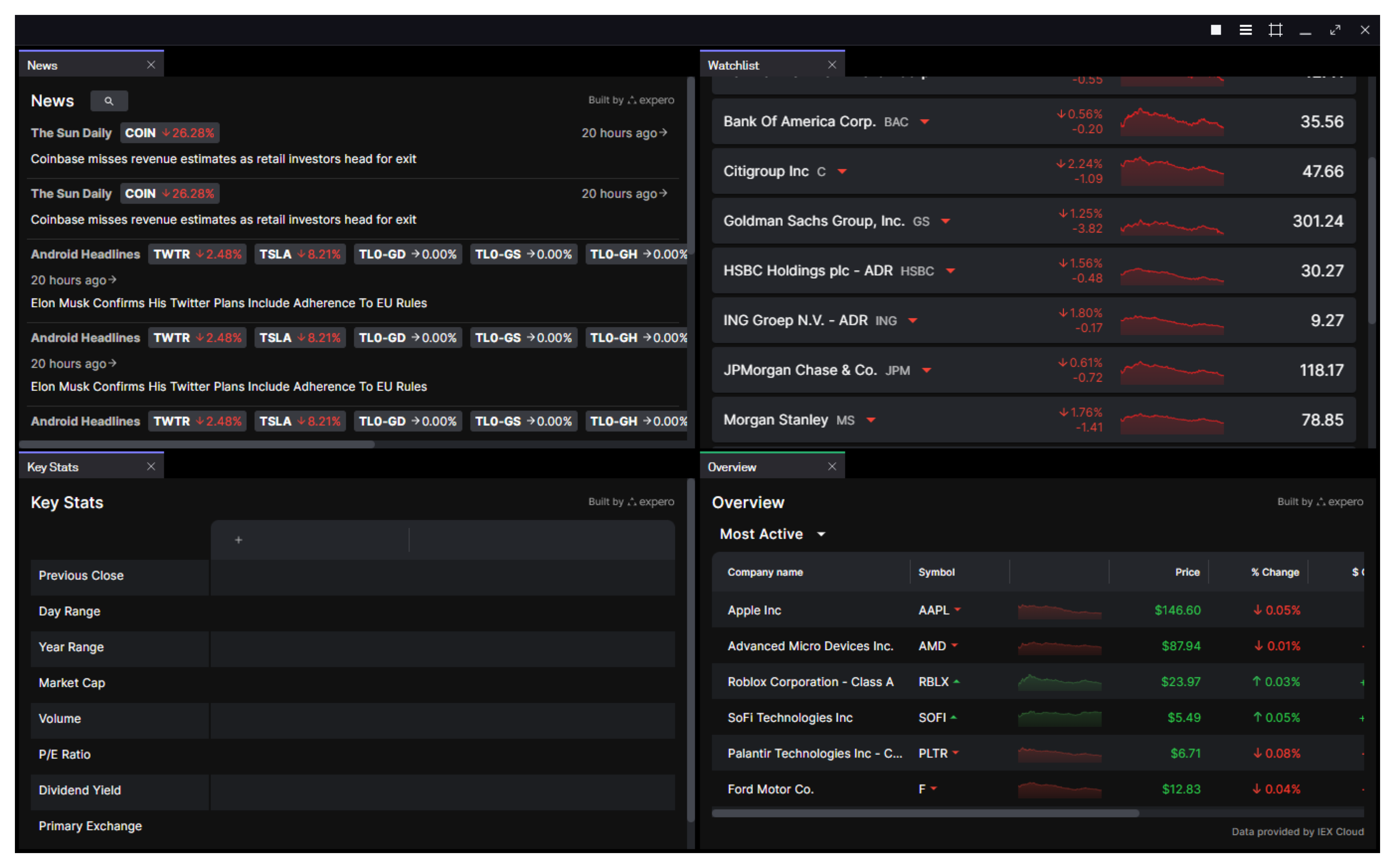
When it comes to representing a layout in code, we can think of layouts as being similar to snapshots.
-
Snapshots are a way to save and restore the positions and configurations of windows on the desktop.
-
Layouts are a way to save and restore the positions and configurations of views in a window.
You can open a window, create views and adjust them to perfection, then save that layout configuration to use in your application.
How to capture a layout
While, technically, you could write the complex JSON of a LayoutConfig by hand, that’s not recommended. Instead, we recommend that you create your views exactly the way you want them, then capture the LayoutConfig data. You can also capture a layout if a user has modified the arrangement of view from the default; you can then reapply that layout as needed by that user.
The function to use when capturing the LayoutConfig data varies depending on whether you want the layout data from the current window, or from another window.
If you want the LayoutConfig data for the current window, use getCurrent or getCurrentSync.
For getCurrent:
const layout = await fin.Platform.Layout.getCurrent();

// Use wrapped instance to control layout, e.g.:
const layoutConfig = await layout.getConfig();
For getCurrentSync:
const layout = fin.Platform.Layout.getCurrentSync();

// Use wrapped instance to control layout, e.g.:
const layoutConfig = await layout.getConfig();
If you want the LayoutConfig data for a window that is not the current window, use wrap or wrapSync.
For wrap:
const layout = await fin.Platform.Layout.wrap({ uuid: fin.me.uuid, name: '<my_window>' });

// Use wrapped instance to control layout, e.g.:
const layoutConfig = await layout.getConfig();
For wrapSync:
const layout = fin.Platform.Layout.wrapSync({ uuid: fin.me.uuid, name: '<my_window>' });

// Use wrapped instance to control layout, e.g.:
const layoutConfig = await layout.getConfig();
How to apply a layout
After you have a LayoutConfig, you can apply it to the layout of views in a window by using the replace function. This replaces the window’s current layout with the new layout. Any views that do not exist in the new layout are destroyed.
let windowIdentity;
if (fin.me.isWindow) {
  windowIdentity = fin.me.identity;
} else if (fin.me.isView) {
  windowIdentity = (await fin.me.getCurrentWindow()).identity;
} else {
  throw new Error('Not running in a platform View or Window');
}

const layout = fin.Platform.Layout.wrapSync(windowIdentity);

const newLayout = {
  content: [
    {
      type: 'stack',
      content: [
        {
          type: 'component',
          componentName: 'view',
          componentState: {
            name: 'new_component_A1',
            processAffinity: 'ps_1',
            url: 'https://www.example.com'
          }
        },
        {
          type: 'component',
          componentName: 'view',
          componentState: {
            name: 'new_component_A2',
            url: 'https://cdn.openfin.co/embed-web/chart.html'
          }
        }
      ]
    }
  ]
};

layout.replace(newLayout);
An alternative to creating a LayoutConfig and applying it to the window is to use the applyPreset function. The applyPreset function creates a new layout based on preset arrangements, which include columns, grids, rows, and tabs. If one of those preset arrangements works for your use case, it can simplify the task of presenting a layout.
let windowIdentity;
if (fin.me.isWindow) {
  windowIdentity = fin.me.identity;
} else if (fin.me.isView) {
  windowIdentity = (await fin.me.getCurrentWindow()).identity;
} else {
  throw new Error('Not running in a platform View or Window');
}

const layout = fin.Platform.Layout.wrapSync(windowIdentity);
await layout.applyPreset({ presetType: 'grid' });
Configure layout behavior
You can configure various aspects of the layout's behavior, such as whether users are allowed to reorder tabs, resize panes, and close views.
Drag-and-drop behavior
When drag-and-drop is enabled, users can:
-
Drag tab headers to reorder them within a tab strip
-
Drag tab headers to move views between different parts of the layout
-
Drag the splitter between views to resize them
The following Boolean options are available as LayoutOptions.settings to control aspects of drag-and-drop behavior:
-
hasHeaders(default true): Whether views (tabs) have tab headers. If false, the layout is displayed with splitters only. -
preventSplitterResize(default false): Whether users can resize views by dragging the splitter between them. If true, splitters are not draggable, and the relative proportions of views cannot be changed. -
reorderEnabled(default true): Whether users can reorder the view tabs in the tab strip by dragging them. Unlike a desktop HERE Core environment, dragging is limited to the current window.
Tab controls
The following properties control the behavior of tabs:
On views:
-
isClosable(default:true): Whether the tab header has a close button to enable closing the tab. -
icon: In v45+, the icon for this view's tab, as a URL. It takes precedence over the layout'sshowFaviconsanddefaultFaviconUrlsettings. It is separate from the windowicon, which sets the taskbar icon. For Core Web layouts, see Tab icons in Core Web layouts.
On LayoutOptions.settings:
-
showMaximiseIcon(default:false): In v40+, whether to show the "maximize" icon on the tab header. Clicking the button maximizes the view to fill the current window; when maximized, the button changes to a "restore" icon that reverts the action. -
tabOverflowBehavior(default:"dropdown"): In v43+, determines the behavior when all tabs cannot be shown in the window. The default (and pre-v43) behavior is to list the excess tabs in a menu. If set to"scroll", the user can scroll the tabs to the left or right to see excess tabs. Setting this option to"scroll"also modifies the DOM structure and enables CSS variables that determine the default and minimum width for tabs, as well as the size and color of the "shadow" at the edge of a scrolling tab. Refer to LayoutOptions.settings in the API reference for details.
The tabOverflowBehavior property applies to layouts in HERE Core Desktop and HERE Core Web platforms.
For HERE Core UI Browser, tab widths are configured through specific properties and overflow behavior is not customizable.
Add custom controls to view tabs
In v45+, you can add your own controls, such as status icons, notification badges, or buttons that open a menu, to view tabs in platform windows and Core Web layouts. Pass a renderCustomTabControls callback when you call fin.Platform.Layout.create(). It works the same way as renderCustomHeaderControls: HERE Core gives you the tab's DOM element, and you add and manage your own elements in it.
For HERE Core UI Browser, don't use this callback. Declare controls in the view options instead. See Add interactive controls to view tabs.
Requirements
- The layout must use the version 2 layout engine. With the version 1 engine, the callback isn't called.
- The layout must set
settings.tabOverflowBehaviorto"scroll".
How the callback works
HERE Core calls the callback once for each view tab, after it has finished building the tab. The callback receives two arguments:
tabElement: the.lm_tabelement for the view tab.context: aCustomTabControlsContextobject with the following properties:
| Property | Description |
|---|---|
viewIdentity | The identity of the view the tab represents. |
titleElement | The tab title. Use it as an anchor to insert controls next to the tab text. |
faviconElement | Optional. The tab icon. It is hidden when favicons are disabled. |
closeElement | Optional. The close button, at the trailing edge of the tab. It is absent when the view is not closable. |
The callback can return a cleanup function. HERE Core calls it when the tab is destroyed, for example when the tab is closed or moved, so you can remove event listeners.
Controls are not saved in layout snapshots, because callbacks can't be serialized. When a tab is re-created, for example when a snapshot is applied, HERE Core calls the callback again.
Mark controls with lm_tab_custom_control
Add the lm_tab_custom_control class to each control, and insert the control as a direct child of tabElement. The class gives the control the same behavior as the tab's close button:
- Users can reach the control with the keyboard. See Keyboard navigation.
- Clicking the control doesn't select or close the tab. Pressing the control and dragging still moves or tears out the tab.
- The control is sized 20×20 pixels by default. To change the size, set the
--layout-tab-custom-control-sizeCSS variable.
Your code is responsible for each control's accessible name, role, and disabled state.
Example
The following example adds a button after the tab title, and opens a custom menu when the user right-clicks the tab title:
await fin.Platform.Layout.create({
  layoutName: 'main',
  container,
  layout: {
    settings: { tabOverflowBehavior: 'scroll' },
    content: [ /* ... */ ]
  },
  renderCustomTabControls: (tabElement, { viewIdentity, titleElement }) => {
    const pinButton = document.createElement('button');
    pinButton.className = 'lm_tab_custom_control';
    pinButton.setAttribute('aria-label', 'Pin view');
    pinButton.title = 'Pin view';
    const pinIcon = document.createElement('img');
    pinIcon.src = 'https://cdn.example.com/pin.svg';
    pinIcon.alt = '';
    pinButton.append(pinIcon);
    titleElement.after(pinButton);

    const onPinClick = () => {
      // Your logic, for example pin the view identified by viewIdentity
    };
    const onTitleContextMenu = (event: MouseEvent) => {
      event.preventDefault();
      // Open your own menu at event.clientX, event.clientY
    };

    pinButton.addEventListener('click', onPinClick);
    titleElement.addEventListener('contextmenu', onTitleContextMenu);

    return () => {
      pinButton.removeEventListener('click', onPinClick);
      titleElement.removeEventListener('contextmenu', onTitleContextMenu);
    };
  }
});
Keyboard navigation for custom controls
Controls marked with lm_tab_custom_control are included in the layout's keyboard navigation as 'active-tab-custom-control' (controls on the active tab) and 'inactive-tab-custom-control' (controls on other tabs). Users move between controls with the arrow keys, in DOM order, and activate them with Enter or Space without switching tabs. If you set your own arrowNavigation array in accessibilityOptions.viewTabOptions, include these values so keyboard users can reach the controls. For details, see Keyboard navigation and accessibility.
Control view title behavior
By default, when the DOM title of the web document changes, through page navigation or updating document.title, the titles of the views it contains are updated to match.
You might prefer that views keep their titles, regardless of what happens to the enclosing document's title.
In HERE Core v41 and later, the optional titlePriority property of componentState (which is used at view-creation time) controls whether the view title is fixed, or updates based on the document title or URL.
It has two possible values:
'document'(default): The view title is the document title from the DOM, if defined; otherwise it displays the view's current URL'options': The view title retains the value defined when it was created
Custom platform considerations
When using the HERE Core Platform API, all of the logic and backing for layout operations are already initialized and baked in.
If, however, you have created a custom platform, one additional step is required. You have to call fin.Platform.Layout.init with the initLayoutOptions of the windows that have views controlled by layouts.
For more information on using init in your custom platform, see the init API reference and code examples.